Plotting Strava data with Python
In my free time I like to go cycling. I easily get discouraged when the weather’s bad, though (In Dutch, people like myself are often called a ‘mooiweerfietser’: a ‘good weather cyclist’). Luckily one of my other hobbies, writing Python scripts, is a lot more suitable for rainy days.
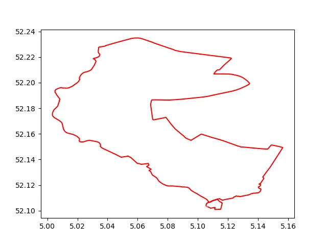
One of the scripts I wrote can plot GPS data I gathered by tracking my cycling activities using Strava, which results in plots like the one above. In this blog, a few interesting parts of one of those script are highlighted. The full code and instructions for running it yourself can be found on Github.
Connecting to the Strava API
First order of business is obtaining the data from Strava. They have a well-documented API, which allows you to programmatically access the data they have on you. This requires authorisation using OAuth 2.0, which takes quite some steps to set up. However, it is described quite clearly here. In a nutshell: once you’ve set up an app and obtained an authorisation code, you can exchange it for an access token. Then, if you send a request to the Strava API, your request must include the access token to be authorised.
With our access token in hand, we can start making requests to the API. For example, to get the 10 most recent rides from your Strava profile, the request looks like this:
import requests

def get_rides(TOKEN, ATHLETE_ID)
    url = f"https://www.strava.com/api/v3/athletes/{ATHLETHE_ID}/activities"
    headers = {"Authorization": f"Bearer {TOKEN}"}
    data = {"per_page": 10, "page": 1}
    response = requests.get(url, headers=headers, data=data)
    return response.json()
This request will return a list of 10 activities, with around 50 attributes each. This includes covered distance (in meters), the elapsed time (in seconds) and more in a JSON format:
[
    {
        'athlete':{
        'id':8952599,
        'resource_state':1
        },
        'name':'Uitwaaien',
        'distance':41290.3,
        'moving_time':5391,
        'elapsed_time':5524,
        'total_elevation_gain':39.0,
        'type':'Ride',
        ...
    },
...
]
Strava's polyline
The activity attribute that will be most important for the rest of the script, is summary_polyline:
summary_polyline = "sq_}H{dd^uFiAoCaEc@]Q[Qy@GC}DpCaFfCaIfMuEzIuAfBkH`Lk@l@gCjFiIpMeCtByE`D{@`AqAzDg@zE]~FFnBy@tI_@dJg@~Gc@`LEbCN`GE`DWfC_@vAaGjN}ApCkHzI{F...
This string turns out to be an encoded list of coordinates, encoded using Google’s Encoded Polyline Algorithm Format. It can easily be decoded by using, for example, the PyPI module polyline:
>> import polyline
>> polyline.decode(summary_polyline)
[(52.1041, 5.10558), (52.10533, 5.10595), (52.10605, 5.10692), (52.10623, 5.10707), (52.10632, 5.10721), (52.10641, 5.1075), (52.10645, 5.10752), (52.1074, 5.10679), (52.10853, 5.10611), ... ]
This already allows us to make our first plot:
import polyline
import matplotlib.pyplot as plt

summary_polyline = "ij_}Hyjd^dB_Gp@aAn@[F[{BwQpA?p@v@rCQf@m@_@iTSaAe\\cEWVKt@yANs@jCkAfB_JhIdEpP|ApD|BfDl@`DcEvCwEbCcHtKiGnLmKnOcClF{HxLoBrBgG~DmAnBy@pCYxBi@xIHlBu@xH{@tPu@fRLpIS~Eo@lC_HtOuJ|LwOrH{FrH}BdEoChBeBt@{HpBwBpBqA|Ba@K{DeGkKnQc@WkEwGsG~Aj@rBjBjWOhA}AtEc@`Ge\\rZyCbH{@|@Ij@r@hA|BxURf@E`@qJzQy_@fz@uGtG{Cy@}GxAyCrCqAfC{AfHmC|SQtEdAxHpBvGv@`EDbFm@pDo@r@sAl@qGc@}ALgJzIkGhNcDzOkBvHsCpD{EvCaGfBqWtC_FpB_F`FeOdV_HtEsJL{JeCqFaC}D}DkH{FyRiD_B}@cC`@{CyAeC`@}RrK_ErAcDnBuFJmBk@sA{@kAoBgD}Iw@_DK}DnAcBUsCTcIIsDkAkGu@eAiCiGyOoSoE{DqImDqE|@aG{AaH}CwDaD_DmFkCgMgB_GeEyFkV_LgE_AaI{BuARoDrBy@z@_BfDSBqCkLoBwFmBsBmDoAgCIkCxB}CtAsI?iFq@{B^cAYsAoBIcDcBkO}A{BuKcd@{Sq`AmAkH_@aFKuN^gFxAyHtPyj@fBcE|E}OzWk}@~CiHXgE`BoIv@wGj]_jE`AgBtAd@j_@j^bRdNn@|Ab@lFp@rAvJ|GxBr@^l@\\ANm@M_FJgu@l@mI`AsHfEeU`BsEjFcKxKoM|FwE~CcB`Cl@|DfH|CjGrInS`EzLnEjSrNb~@hHjc@jBnRzFv~@fCjf@jAn\\N|Ge@r}@L|Fj@t@tAXxPhBdeAkG`Du@M{DmHog@u@gDDiA`^cSdWmP|[e\\fDaE|HaGxB{D|FeO?e@_@u@sZue@YcBxOyl@nFiVtGqVnTir@r@gBd@e@VuCxCkJIgEfGyiAdAwZe@w@kQ{LYy@zDyWvDoRd@_A~zAfq@|q@l_@l@FnBaBfBe@fVvL`AxAt@tB^kEnBKlBf@~AhAr@`Av@zBtEeBfAyElAg@hGnA`B|@jBnBp@`AXbAAzDr@fCC`D`@lG\\NXfC`C`Fl@rBtGnc@Et@cA`Bn@`CyApDxBzD~@lCvCvBtEj]xBpKGp@aFnJ?b@~GpXdBdE~BnD|AxHxC~Dr@ItEdAzB_@"

coordinates = polyline.decode(summary_polyline)

ride_longitudes = [coordinate[1] for coordinate in coordinates]
ride_latitudes = [coordinate[0] for coordinate in coordinates]

plt.plot(ride_longitudes, ride_latitudes, 'r-', alpha=1)
plt.show()

Adding satellite imagery as background
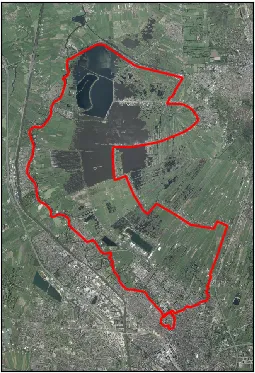
The next step towards the final result is adding satellite imagery as background. As you might’ve guessed, there’s a Python module for that: Matplotlib’s Basemap. It should be noted here that Basemap is deprecated in favour of the Cartopy project, but I’ve found it still works quite well. (Update 29/11/2021 since installing Basemap has become increasingly tricky since its deprecation, I did end up moving over to Cartopy). If you provide it with the minimum and maximum latitudes and longitudes you want an image for, Basemap’s arcgisimage() gets you the satellite image of this area. Furthermore, the Basemap object instantiated with these latitudes and longitudes can be called on any given coordinates to project them on that same satellite image. As projecting a globe on a 2-dimensional plane is an all but trivial task (obligatory xkcd), this takes a lot of complexity out of your hands (by the way, Basemap uses the Plate Carrée projection by default).
import polyline
import matplotlib.pyplot as plt

from mpl_toolkits.basemap import Basemap

summary_polyline = "ij_}Hyjd^dB_Gp@aAn@[F[{BwQpA?p@v@rCQf@m@_@iTSaAe\\cEWVKt@yANs@jCkAfB_JhIdEpP|ApD|BfDl@`DcEvCwEbCcHtKiGnLmKnOcClF{HxLoBrBgG~DmAnBy@pCYxBi@xIHlBu@xH{@tPu@fRLpIS~Eo@lC_HtOuJ|LwOrH{FrH}BdEoChBeBt@{HpBwBpBqA|Ba@K{DeGkKnQc@WkEwGsG~Aj@rBjBjWOhA}AtEc@`Ge\\rZyCbH{@|@Ij@r@hA|BxURf@E`@qJzQy_@fz@uGtG{Cy@}GxAyCrCqAfC{AfHmC|SQtEdAxHpBvGv@`EDbFm@pDo@r@sAl@qGc@}ALgJzIkGhNcDzOkBvHsCpD{EvCaGfBqWtC_FpB_F`FeOdV_HtEsJL{JeCqFaC}D}DkH{FyRiD_B}@cC`@{CyAeC`@}RrK_ErAcDnBuFJmBk@sA{@kAoBgD}Iw@_DK}DnAcBUsCTcIIsDkAkGu@eAiCiGyOoSoE{DqImDqE|@aG{AaH}CwDaD_DmFkCgMgB_GeEyFkV_LgE_AaI{BuARoDrBy@z@_BfDSBqCkLoBwFmBsBmDoAgCIkCxB}CtAsI?iFq@{B^cAYsAoBIcDcBkO}A{BuKcd@{Sq`AmAkH_@aFKuN^gFxAyHtPyj@fBcE|E}OzWk}@~CiHXgE`BoIv@wGj]_jE`AgBtAd@j_@j^bRdNn@|Ab@lFp@rAvJ|GxBr@^l@\\ANm@M_FJgu@l@mI`AsHfEeU`BsEjFcKxKoM|FwE~CcB`Cl@|DfH|CjGrInS`EzLnEjSrNb~@hHjc@jBnRzFv~@fCjf@jAn\\N|Ge@r}@L|Fj@t@tAXxPhBdeAkG`Du@M{DmHog@u@gDDiA`^cSdWmP|[e\\fDaE|HaGxB{D|FeO?e@_@u@sZue@YcBxOyl@nFiVtGqVnTir@r@gBd@e@VuCxCkJIgEfGyiAdAwZe@w@kQ{LYy@zDyWvDoRd@_A~zAfq@|q@l_@l@FnBaBfBe@fVvL`AxAt@tB^kEnBKlBf@~AhAr@`Av@zBtEeBfAyElAg@hGnA`B|@jBnBp@`AXbAAzDr@fCC`D`@lG\\NXfC`C`Fl@rBtGnc@Et@cA`Bn@`CyApDxBzD~@lCvCvBtEj]xBpKGp@aFnJ?b@~GpXdBdE~BnD|AxHxC~Dr@ItEdAzB_@"

coordinates = polyline.decode(summary_polyline)

ride_longitudes = [coordinate[1] for coordinate in coordinates]
ride_latitudes = [coordinate[0] for coordinate in coordinates]

m = Basemap(
    llcrnrlon=min(ride_longitudes) - 0.02,
    llcrnrlat=min(ride_latitudes) - 0.02,
    urcrnrlon=max(ride_longitudes) + 0.02,
    urcrnrlat=max(ride_latitudes) + 0.02,
    epsg=23095,
)

m.arcgisimage(service="World_Imagery", verbose=True)
x, y = m(ride_longitudes, ride_latitudes)
m.plot(x, y, 'r-')

plt.show()

And of course, if we can do it for one ride, we can do it for all of them by simply looping through them and adding them to the map:

Separating into clusters
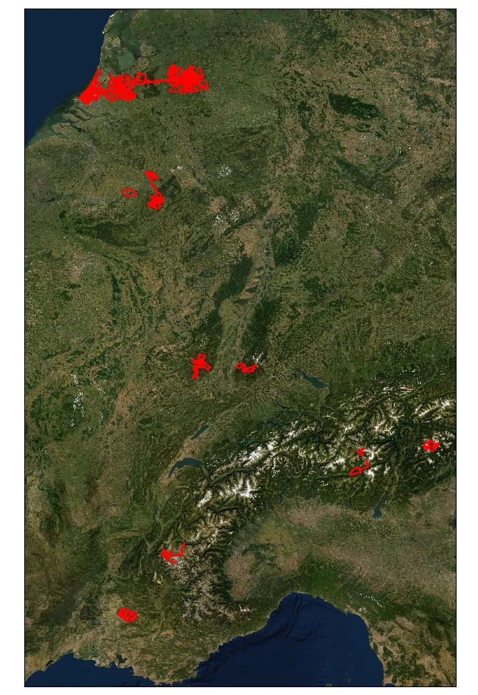
While this is nice, it would be even nicer to see a bit more detail. In my case, there seem to be eight ‘clusters’ of rides (a big one spanning the Netherlands with rides from the three places I’ve lived in the past years and seven smaller ones corresponding to cycling holidays), which could be isolated and zoomed in on.
To do so, we’ll apply the following logic:
- The bounding box of a ride is the smallest rectangle that contains the whole ride;
- Rides belong in the same cluster when their bounding boxes overlap. (I added a bit of margin here, so that rides that almost overlap also end up in the same cluster.)
To get our list of rides per cluster, we’ll first make a list of all rides any given ride overlaps with. This is done by comparing every bounding box to every other bounding box and check if they overlap. Simply put, a pair of bounding boxes overlap if the one is not either entirely above, below, to the right or to the left of the other. The full code for this part can be found in group_overlapping.py.
The outcome of this step is a list containing a list for every bounding box. This list per bounding box contains the indices of all other bounding boxes it overlaps with. For example, if ride 0 does not overlap with any other rides, ride 1 overlaps with ride 2, 2 overlaps with 1, 3 overlaps with 4, 4 overlaps with 3 and 5, 5 overlaps with 4 and 6 and 6 overlaps with 5, we’ll get:
[[], [2], [1], [4], [3, 5], [4, 6], [5]]
Then, we’ll merge these lists if they have any common elements (this part was heavily inspired by the answers to this StackOverflow question). Continuing the previous example, we get three clusters:
[[0], [1, 2], [3, 4, 5, 6]]
Using this, we can give each cluster their own subplot: every list corresponds to one subplot in which all rides in that list are plotted. This results in the picture at the bottom of the page, which allow you to see more detail.

Update 21/06/2020: The script described in this blog is now running at https://nickdoornekamp.pythonanywhere.com/, where you can connect your own Strava profile to make pictures like the one above.
This post was originally published on Medium